Complication ≠ Sophistication
Case Study:
GS Marquee
Launch: 2019
Marquee is Goldman Sachs’ enterprise trading and risk-management platform. With a vision of becoming the operating system of trading floors across the globe Marquee aims to make Goldman the nexus of global trading.
As Marquee matured and transitioned from the web to traders' desktops, we were asked to optimize existing user journeys and bring a sense of Shoshin (初心)—a “beginner's mind”—to the product suite. Aiming for simple yet innovative interfaces.
Contributions
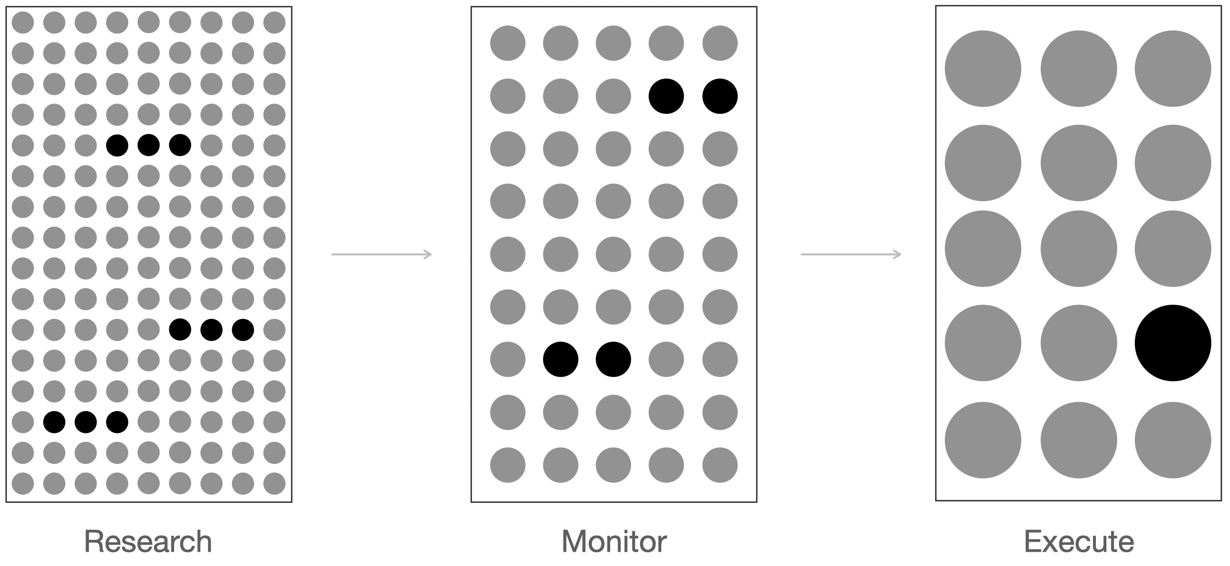
- Research
- Product Strategy
- Content Strategy
- User Flows
- User Interface Design
- Usability Testing
- Systems Design
- Design Direction
- Ongoing Optimization
Cognitive Interfaces
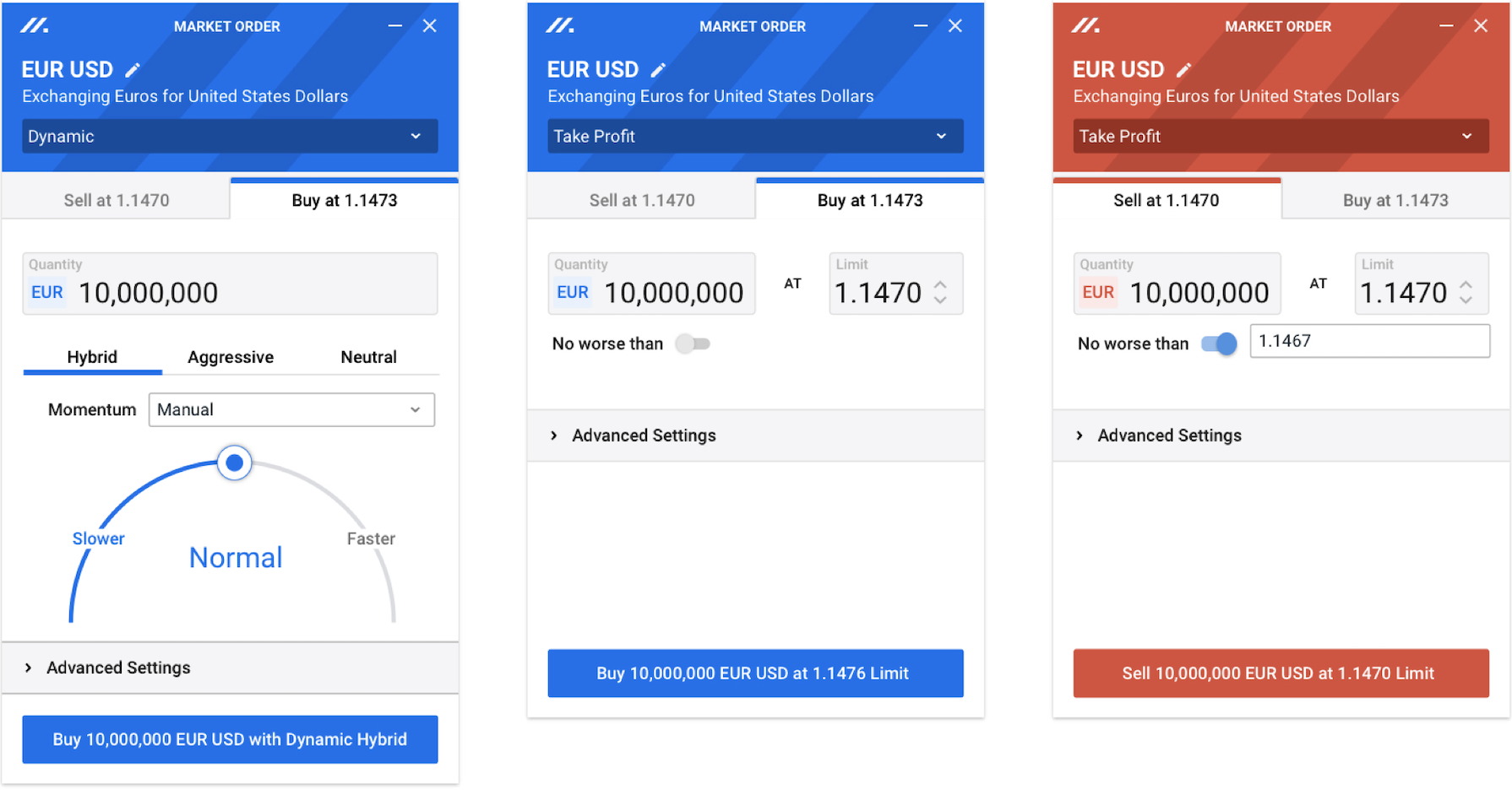
After conducting ethnography and competitive analysis, we observed a clear dissonance between the software and traders' mental models. Legacy tools rendered financial concepts, models, and principles through dropdowns, radio buttons, and input fields, resulting in an unintuitive and unwieldy interfaces. To address this, we adopted a visually led approach aligned with traders' thought processes, replacing typical form fields with interfaces that reflect how users think. The result is a visually rich, intuitive interface that enhances speed, ease of use, and excitement on the trading floor.
This interface is clearly the best thing I've seen from the product.Andrew Mugica — Vice President, Commodities & Natural Gas Trading
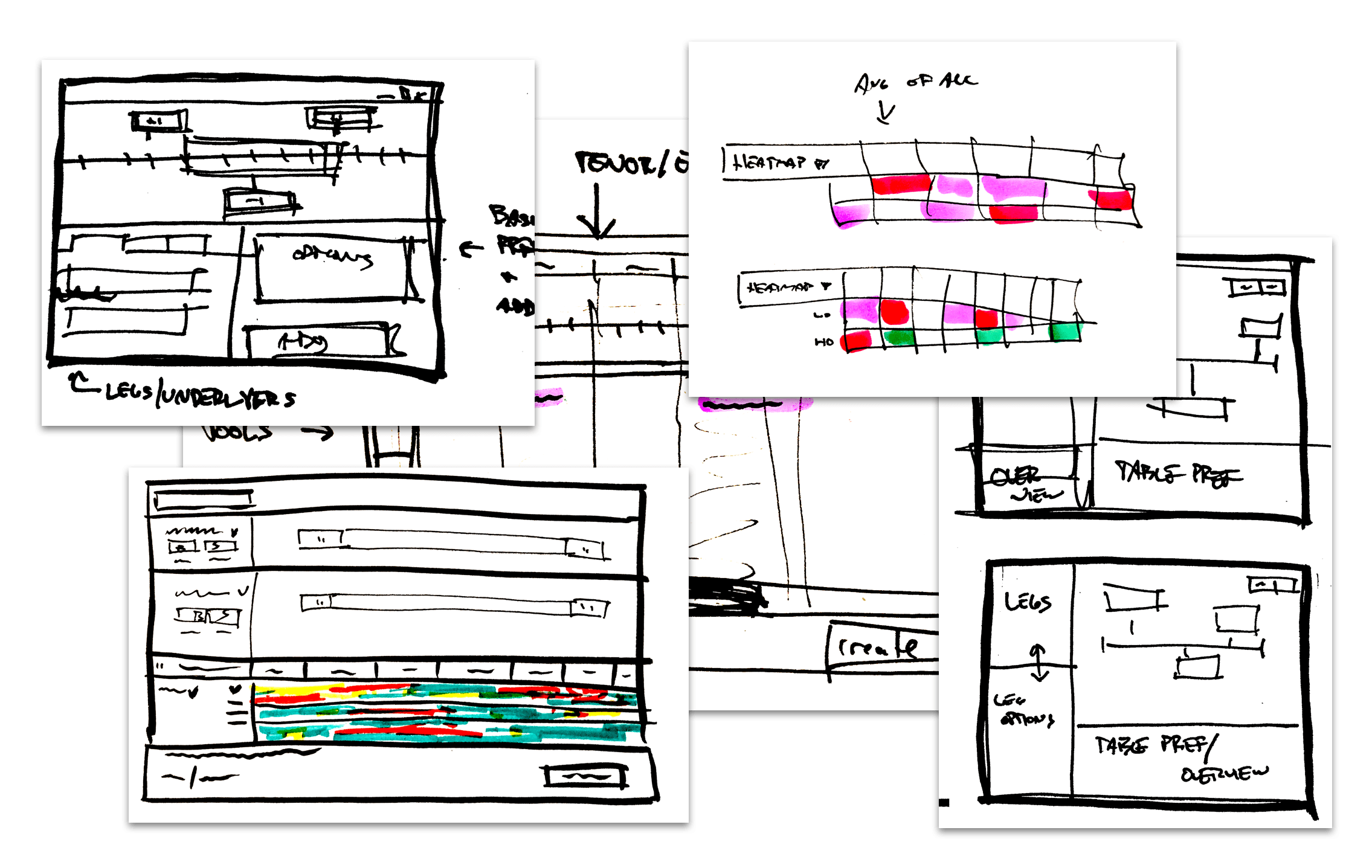
Iteration
Through evaluative usability testing we iterated on the interface above. The iteration below focuses on promoting better decision making through a more detailed data set.
100s Of More RFQs
This is the type of UI we need, it is the most interesting and exciting part of Marquee. It's cool. I think it can be a real differentiator on the sales front.Russell Martin — Vice President, Systematic Market Making
Workflow Shortfalls
Existing trader workflows were disjointed and incomplete. Which forced traders to rely on numerous makeshift solutions and off-the-shelf tools, leading to bloated processes. In reviewing these workflows, we saw an opportunity to streamline them, retire a series of internal trader-made tools, and create a connected and concise set of user journeys.
Optimizing Display Density
Traders expect the smallest possible windows from their trading OS to maximize on-screen information. However, this doesn’t mean the information in each window should also be as small as possible. As traders progress through their workflow, display density should adapt. As they approach trade execution, information should become larger, with more white space to reduce “fat finger” mistakes.
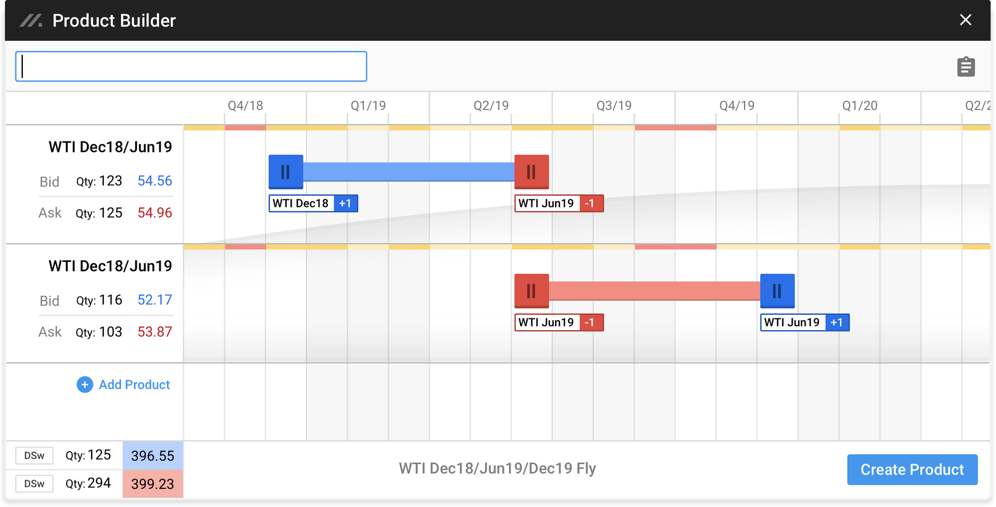
Consolidate
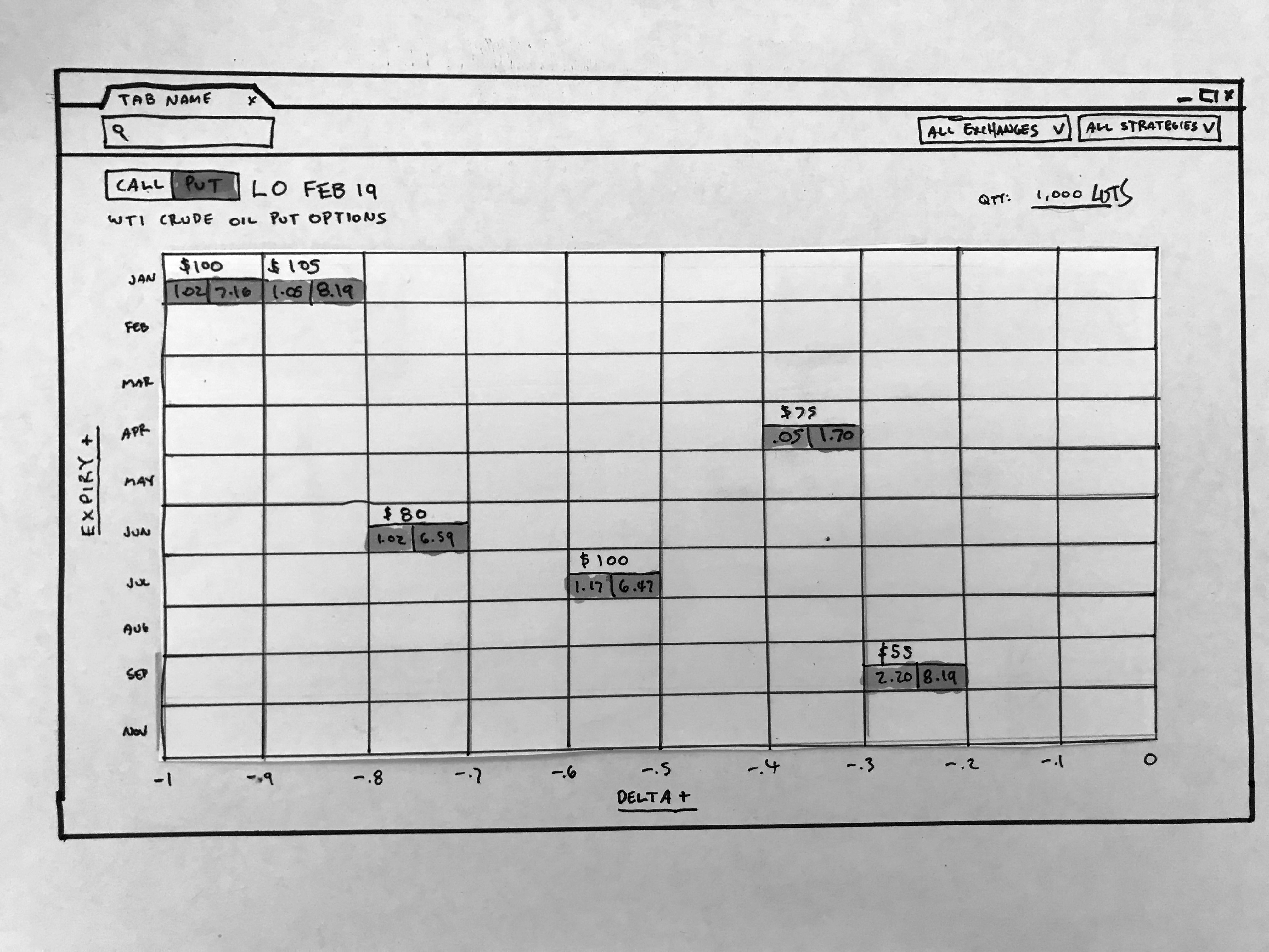
As part of our workflow consolidation we eliminated three separate pieces of software by introducing a new interface, the Options Matrix. The Matrix enables traders to tailor their market view based on volatility rather than price, aligning with their mental model and providing a sensory understanding of the market. This is also where we first introduced the “inspect” UI pattern that progressively discloses information as traders need it.
03 UIs Combined into One
 Note: Paper prototyping proved extremely valuable. Their low-fidelity nature forced traders to focus on the things that matter during product development. Instead of getting caught up in the accuracy of the pricing, volume, and other numbers, which often occurred with high-fidelity prototypes.
This is by far the best and most intuitive interface I have seen for trading Options.Sidney Torjdman — Vice President, Crude & Crude Derivatives
Consistent
As we continued to examine Marquee's core user journeys and components, we noticed inconsistencies in the order ticket interfaces. To address this, we developed a classification system and information architecture that ensured consistent hierarchy and flow across all tickets. This structured approach, supported by thorough documentation empowered engineers to independently create new order UIs, reducing reliance on product and design input and improving workflow efficiency.
17 Order Ticket's Redesigned
It still blows my mind that you are not a UX Researcher by trade, you crushed it!Alyssa Nitz — Head of UX Research, Marquee